利用Python实现Mathematica的配色方案
前言
不得不说Mathematica中的一些颜色还是很好看的,但是当数据文件较大的时候用Mathematica绘图就会有点卡顿,不如用Python来的方便一些,这里就整理一下如何将Mathematica中的配色数据导出来,然后再加载到Python中用来绘图
- 首先将你喜欢的颜色数据导出来,这里可以通过改变变量dk来控制颜色间隔的大小
1
2
3
4
dk = 1/255;
colorFunction = ColorData["LightTemperatureMap", "ColorFunction"];
colorValues = Table[colorFunction[x], {x, 0, 1, dk}];
Export["LightTemperatureMap.dat", colorValues, "Table"];
将Mathematica中中导数颜色的命令封装成一个函数1
2
3
4
5func1[colorname_] := Module[{colorFunctionlist, colorValues},
colorFunctionlist = ColorData[colorname, "ColorFunction"];
colorValues = Table[colorFunctionlist[x], {x, 0, 1, 1/255}];
Export[StringJoin[colorname, ".dat"], colorValues, "Table"];]
func1["DeepSeaColors"]
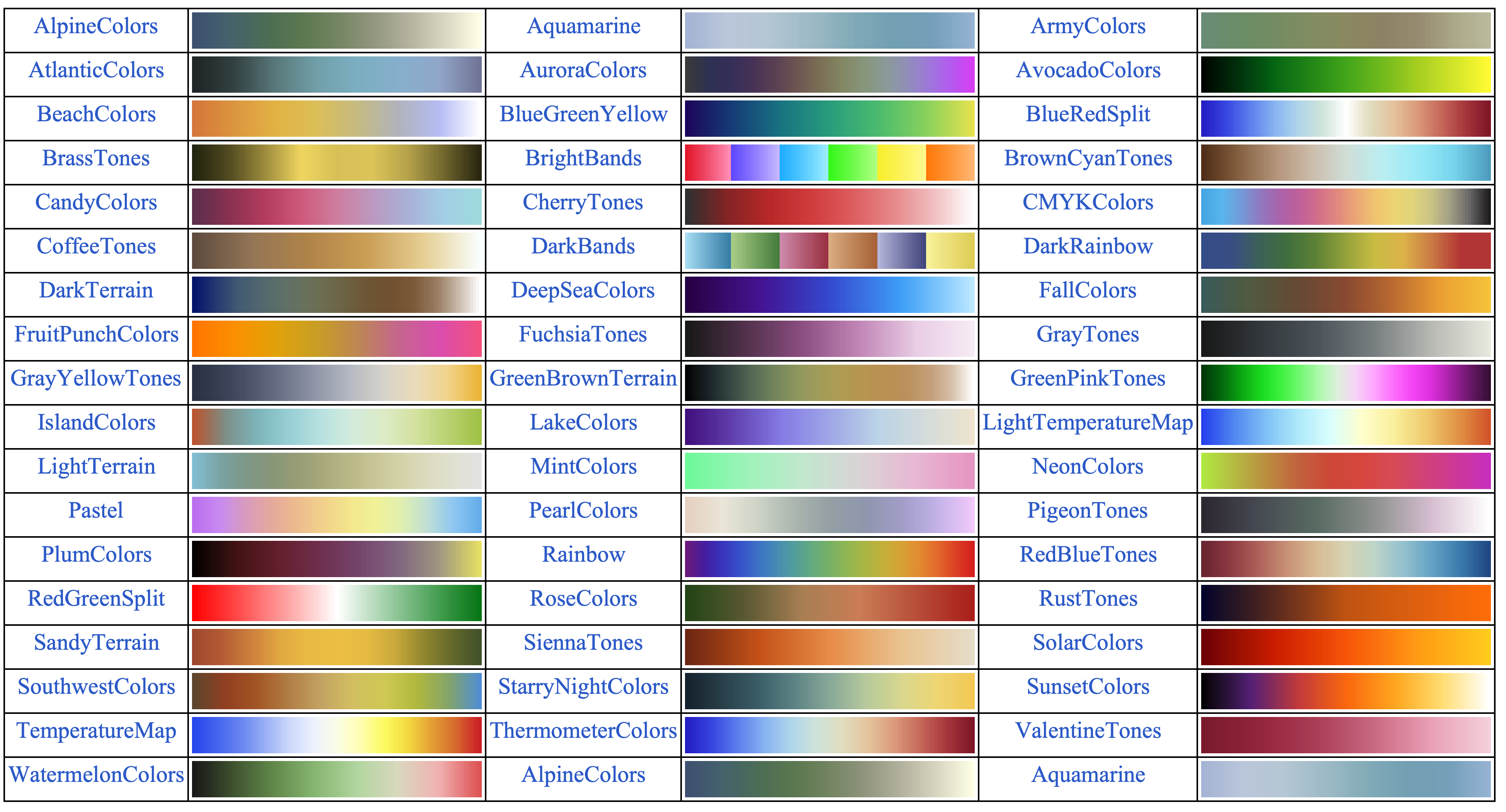
执行下面的命令获取Mathematica中渐变色的名称和颜色示例1
2
3
4
5
6
7
8colornameList =
Style[#, 20, Blue, FontFamily -> "Times New Roman"] & /@
ColorData["Gradients"];
color = ColorData["Gradients", "Image"];
partitionedData =
Partition[Flatten[Transpose[{colornameList, color}], 1], 6,
6, {1, 1}];
Grid[partitionedData, Frame -> All]
下面就将这个颜色数据导入到Python中创建自己的colorbar
1
2
3
4
5
6
7
8
9
10
11
12
13with open("LightTemperatureMap.dat", "r") as file:
lines = file.readlines()
# 解析颜色数据
colors = []
for line in lines:
# 去掉多余的字符(例如 "RGBColor[" 和 "]")
line = line.replace("RGBColor[", "").replace("]", "").strip()
# 按逗号分割,提取 R, G, B 值
r, g, b = map(float, line.split(","))
colors.append((r, g, b))
# 将颜色数据转换为 matplotlib 的 colormap 格式
cmap = LinearSegmentedColormap.from_list("LightTemperatureMap", colors)最后就在绘制密度图的时候直接使用这个颜色配置即可
完整代码
1 | import numpy as np |
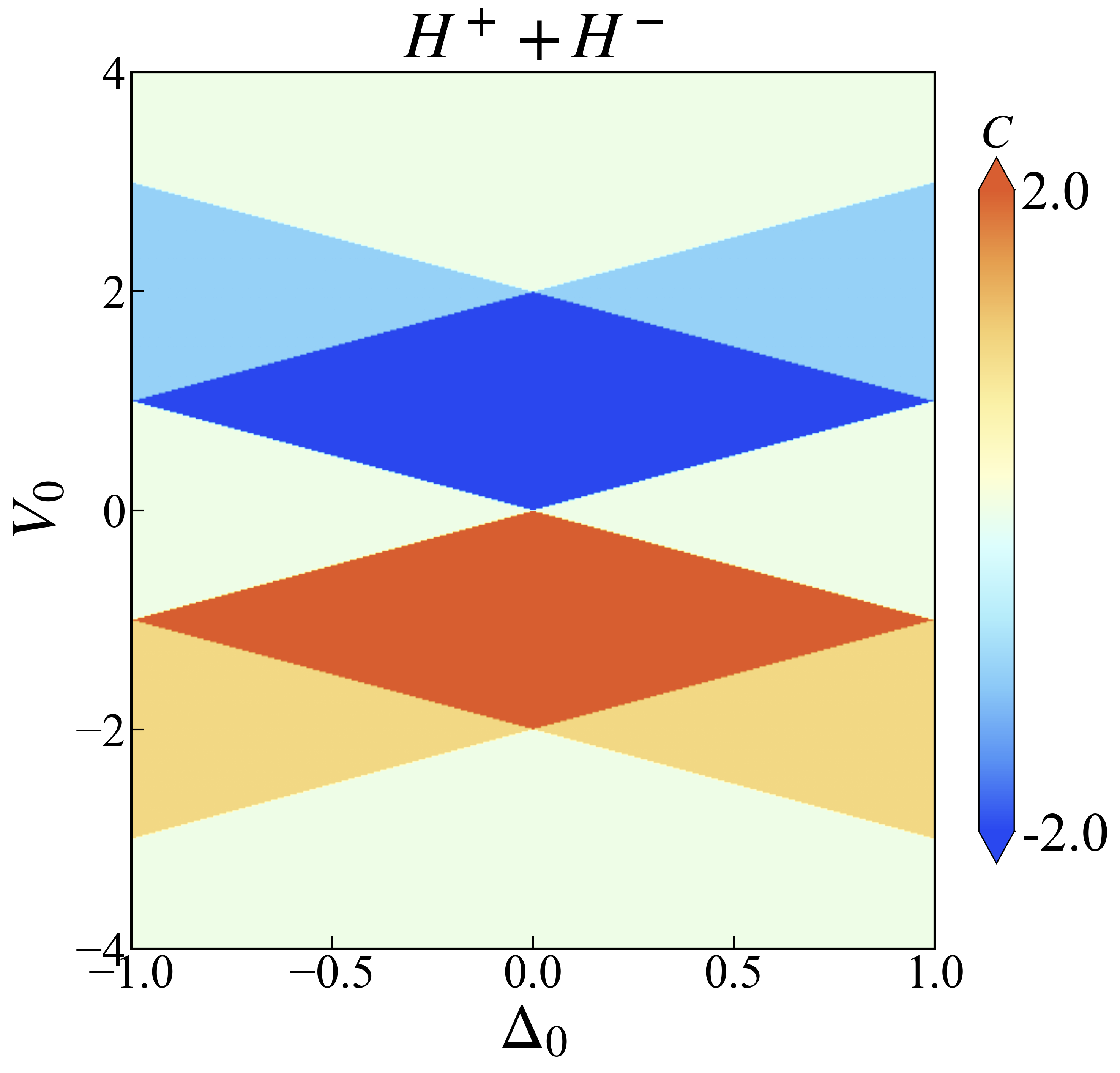
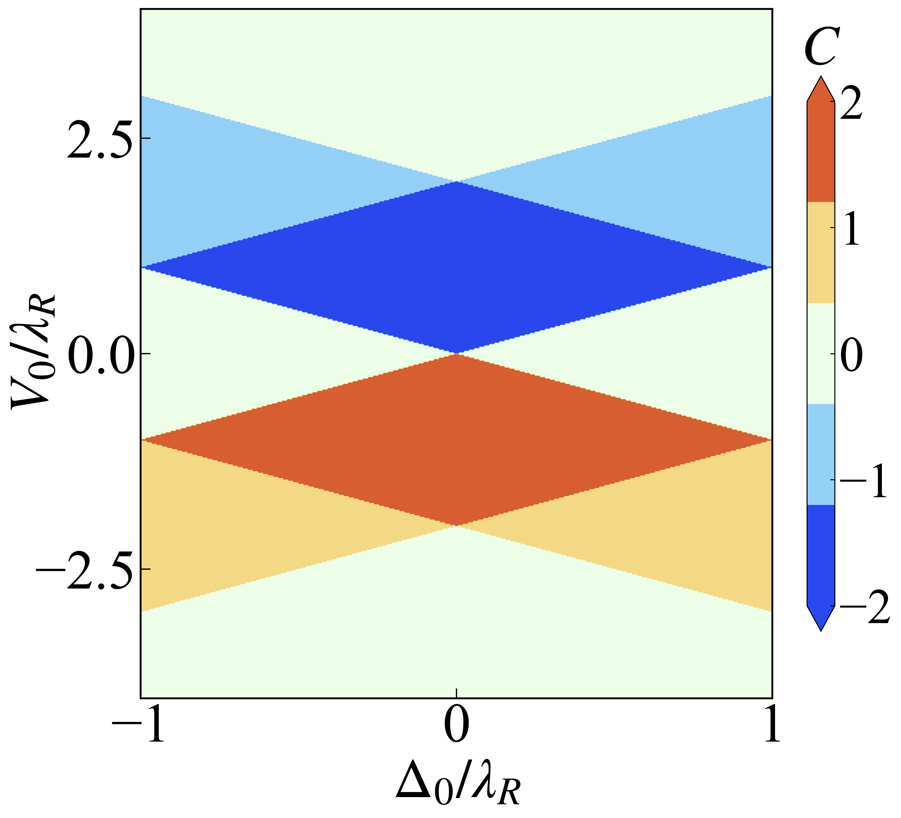
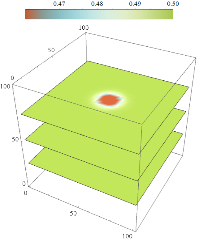
继续优化一下,因为这里其实想用的颜色来区分体系的Chern数,但是colorbar却是渐变色,表意不明。实际上就需要将colorbar的色条也做离散处理1
2
3
4colorbar_label = np.sort(list(set(z0))) # Z0 是整个区域中的Chern数
levels = np.linspace(z0min,z0max, len(colorbar_label) + 1) # 分成 5 份,需要 6 个边界
norm = BoundaryNorm(levels, ncolors = 256) # 将颜色映射到指定的区间
sc = plt.imshow(z0, interpolation='bilinear', cmap = cmap, origin = 'lower', extent = [x0_min, x0_max, y0_min, y0_max],norm = norm) # 设置坐标轴范围
上面的代码中$z0$是整个区域中的Chern数,通过取集合的方式去除重复的数就能得到所有的Chern数了。如果Chern数共有3个,那么就需要将颜色分成4份,也就是用第二行代码控制。最后在绘图的时候再通过norm参数来实现颜色条离散的控制,结果如下
完整的绘图代码如下1
2
3
4
5
6
7
8
9
10
11
12
13
14
15
16
17
18
19
20
21
22
23
24
25
26
27
28
29
30
31
32
33
34
35
36
37
38
39
40
41
42
43
44
45
46
47
48
49
50
51
52
53
54
55
56
57
58
59
60
61
62
63
64
65
66
67
68
69
70
71
72
73
74
75
76
77
78
79
80
81
82
83
84
85
86
87
88
89
90
91
92
93
94
95
96
97
98
99
100
101
102
103
104
105
106
107import numpy as np
import matplotlib.pyplot as plt
from matplotlib import rcParams
import os
from matplotlib.colors import LinearSegmentedColormap,BoundaryNorm
plt.rc('font', family='Times New Roman')
config = {"font.size": 35,"mathtext.fontset":'stix',"font.serif": ['SimSun']}
rcParams.update(config) # Latex 字体设置
#------------------------------------------------------------------------------------------------------------------------------------------------------------------------------
def Make_color(color):
# with open("LightTemperatureMap.dat", "r") as file:
with open(color, "r") as file:
lines = file.readlines()
# 解析颜色数据
colors = []
for line in lines:
# 去掉多余的字符(例如 "RGBColor[" 和 "]")
line = line.replace("RGBColor[", "").replace("]", "").strip()
# 按逗号分割,提取 R, G, B 值
r, g, b = map(float, line.split(","))
colors.append((r, g, b))
# 将颜色数据转换为 matplotlib 的 colormap 格式
cmap = LinearSegmentedColormap.from_list("LightTemperatureMap", colors)
return cmap
#------------------------------------------------------------------------------------------------------------------
def plot_Chern_Number(ind):
if ind == 1 :
dataname = "Phase-Chern-delta0V0.dat"
elif ind == 2 :
dataname = "Phase-Chern-J0V0.dat"
else:
dataname = "Phase-Chern-delta0J0.dat"
picname = os.path.splitext(dataname)[0] + ".png"
da = np.loadtxt(dataname)
x0 = da[:, 0] # delta0 数据
y0 = da[:, 1] # d0 数据
z0 = np.array(da[:, 2]) # Chern 数数据
colorbar_label = np.sort(list(set(z0)))
# 获取 delta0 和 d0 的范围
x0_min, x0_max = np.min(x0), np.max(x0)
y0_min, y0_max = np.min(y0), np.max(y0)
# 将 z0 数据重塑为二维数组
xn = int(np.sqrt(len(x0)))
z0 = z0.reshape(xn, xn)
z0min = int(np.min(z0))
z0max = int(np.max(z0))
levels = np.linspace(z0min,z0max, len(colorbar_label) + 1) # 分成 5 份,需要 6 个边界
norm = BoundaryNorm(levels, ncolors = 256) # 将颜色映射到指定的区间
# 创建绘图
plt.figure(figsize=(10, 9))
# cmap = Make_color("LightTemperatureMap.dat")
cmap = Make_color("RedBlueTones.dat")
# sc = plt.imshow(z0, interpolation='bilinear', cmap="magma", origin='lower', extent=[x0_min, x0_max, y0_min, y0_max]) # 设置坐标轴范围
# sc = plt.imshow(z0, interpolation='bilinear', cmap = "RdYlBu", origin = 'lower', extent = [x0_min, x0_max, y0_min, y0_max]) # 设置坐标轴范围
sc = plt.imshow(z0, interpolation='bilinear', cmap = cmap, origin = 'lower', extent = [x0_min, x0_max, y0_min, y0_max],norm = norm) # 设置坐标轴范围
# sc = plt.imshow(z0, interpolation='bilinear', cmap = "jet", origin = 'lower', extent = [x0_min, x0_max, y0_min, y0_max],norm = norm) # 设置坐标轴范围
# 添加 colorbar
# cb = plt.colorbar(sc, fraction = 0.03, ticks=[np.min(z0),-1,0,1, np.max(z0)], extend = 'both')
cb = plt.colorbar(sc, fraction = 0.03, ticks = colorbar_label, extend = 'both')
# cb = plt.colorbar(sc, fraction = 0.03, extend = 'both')
cb.ax.set_title(r"$C$", fontsize = 30)
cb.ax.tick_params(size = 1)
# cb.ax.set_yticklabels([format(np.min(z0), ".1f"), format(np.max(z0), ".1f")])
if dataname == "Phase-Chern-J0V0.dat":
plt.ylabel(r"$V_0$")
plt.xlabel(r"$J_0$")
elif dataname == "Phase-Chern-delta0V0.dat":
plt.xlabel(r"$\Delta_0$")
plt.ylabel(r"$V_0$")
else:
plt.xlabel(r"$\Delta_0$")
plt.ylabel(r"$J_0$")
plt.tick_params(axis ='x',width = 1,length = 8, direction = "in")
plt.tick_params(axis = 'y',width = 1,length = 8, direction = "in")
# plt.axhline(y = -0.5, color = 'red', linestyle =':', linewidth = 1.5) # 红色实线
# plt.axhline(y = 0.5, color = 'blue', linestyle =':', linewidth = 1.5) # 蓝色点线
# plt.axvline(x = -0.5, color = 'red', linestyle =':', linewidth = 1.5) # 红色实线
plt.axvline(x = 0.5, color = 'black', linestyle ='--', linewidth = 3.0) # 蓝色点线
# plt.axis('scaled')
# 设置坐标轴样式
ax = plt.gca()
ax.locator_params(axis='x', nbins=3) # x 轴最多显示 3 个刻度
ax.locator_params(axis='y', nbins=3) # y 轴最多显示 3 个刻度
ax.set_aspect('auto') # 自动调整比例
ax.spines["bottom"].set_linewidth(3.0)
ax.spines["left"].set_linewidth(3.0)
ax.spines["right"].set_linewidth(3.0)
ax.spines["top"].set_linewidth(3.0)
# 保存图像
# plt.show()
plt.savefig(picname, dpi=300, bbox_inches='tight')
plt.close()
#------------------------------------------------------------
if __name__=="__main__":
plot_Chern_Number(1)
# plot_Chern_Number(2)
# plot_Chern_Number(3)
其中的第一个函数Make_color中的输入就是用Mathematica导出的颜色文件的名称了。
文件下载
所有使用到的数据和绘图程序点击这里下载
鉴于该网站分享的大都是学习笔记,作者水平有限,若发现有问题可以发邮件给我
- yxliphy@gmail.com
也非常欢迎喜欢分享的小伙伴投稿


欢迎关注公众号,有趣的内容也会在上面同步。 有密码的文章属于正在建设中或者没有通过验证的内容,若有需要可通过邮件联系。