该笔记主要整理了如何在Python中实现Mathematica的配色
前言
不得不说Mathematica中的一些颜色还是很好看的,但是当数据文件较大的时候用Mathematica绘图就会有点卡顿,不如用Python来的方便一些,这里就整理一下如何将Mathematica中的配色数据导出来,然后再加载到Python中用来绘图
- 首先将你喜欢的颜色数据导出来,这里可以通过改变变量dk来控制颜色间隔的大小
dk = 1/255;
colorFunction = ColorData["LightTemperatureMap", "ColorFunction"];
colorValues = Table[colorFunction[x], {x, 0, 1, dk}];
Export["LightTemperatureMap.dat", colorValues, "Table"];
将Mathematica中中导数颜色的命令封装成一个函数
func1[colorname_] := Module[{colorFunctionlist, colorValues},
  colorFunctionlist = ColorData[colorname, "ColorFunction"];
  colorValues = Table[colorFunctionlist[x], {x, 0, 1, 1/255}];
  Export[StringJoin[colorname, ".dat"], colorValues, "Table"];]
func1["DeepSeaColors"]
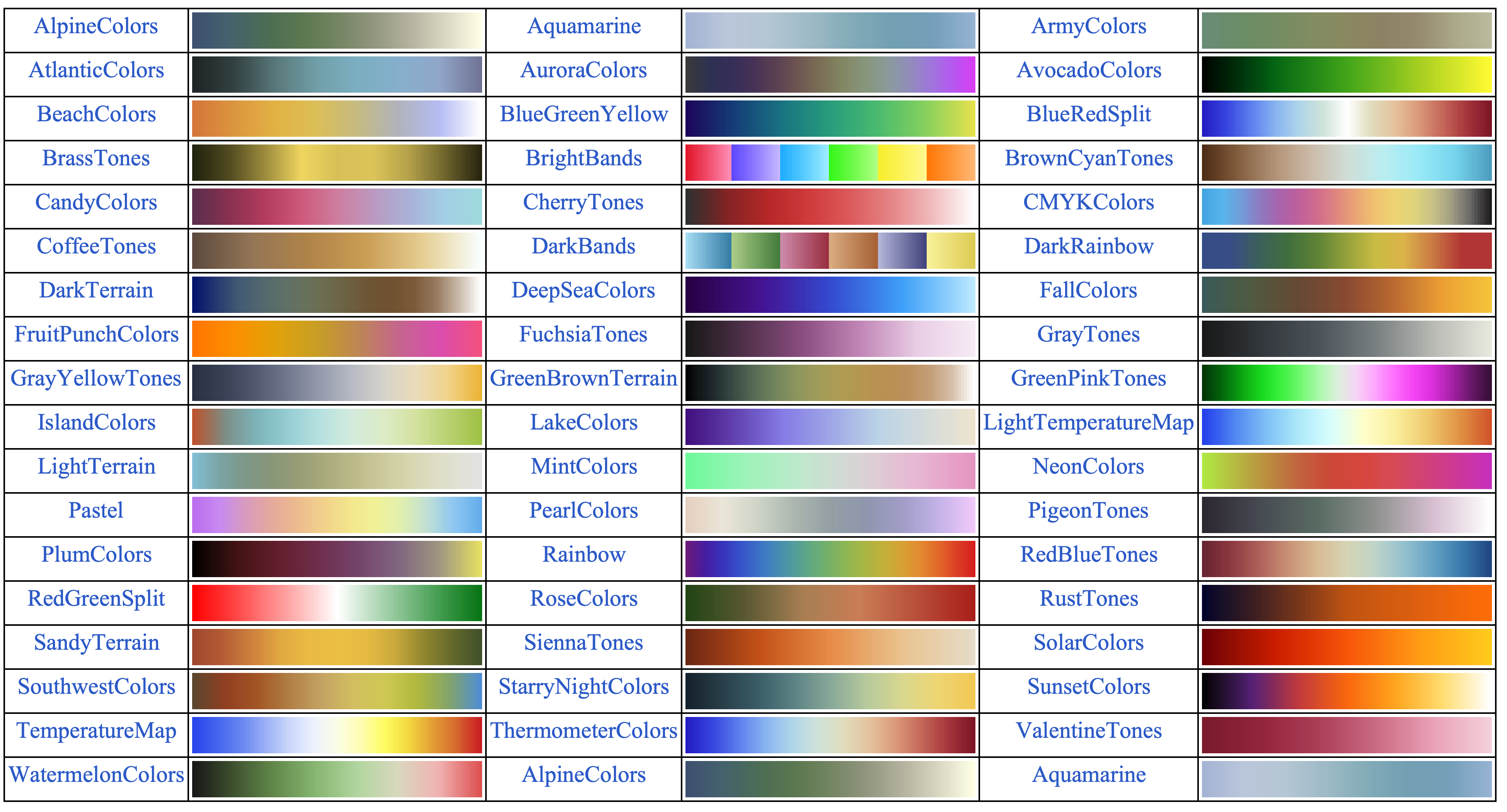
执行下面的命令获取Mathematica中渐变色的名称和颜色示例
colornameList =
  Style[#, 20, Blue, FontFamily -> "Times New Roman"] & /@
   ColorData["Gradients"];
color = ColorData["Gradients", "Image"];
partitionedData =
  Partition[Flatten[Transpose[{colornameList, color}], 1], 6,
   6, {1, 1}];
Grid[partitionedData, Frame -> All]
- 下面就将这个颜色数据导入到Python中创建自己的colorbar
with open("LightTemperatureMap.dat", "r") as file: lines = file.readlines() # 解析颜色数据 colors = [] for line in lines: # 去掉多余的字符(例如 "RGBColor[" 和 "]") line = line.replace("RGBColor[", "").replace("]", "").strip() # 按逗号分割,提取 R, G, B 值 r, g, b = map(float, line.split(",")) colors.append((r, g, b)) # 将颜色数据转换为 matplotlib 的 colormap 格式 cmap = LinearSegmentedColormap.from_list("LightTemperatureMap", colors) - 最后就在绘制密度图的时候直接使用这个颜色配置即可
完整代码
import numpy as np
import matplotlib.pyplot as plt
from matplotlib import rcParams
import os
import matplotlib.gridspec as gridspec
from matplotlib.path import Path
import matplotlib.colors as mcolors
from matplotlib.colors import LinearSegmentedColormap
plt.rc('font', family='Times New Roman')
config = {
"font.size": 35,
"mathtext.fontset":'stix',
"font.serif": ['SimSun'],
}
rcParams.update(config) # Latex 字体设置
#------------------------------------------------------------------------------------------------------------------------------------------------------------------------------
def Make_color():
    with open("LightTemperatureMap.dat", "r") as file:
        lines = file.readlines()
    # 解析颜色数据
    colors = []
    for line in lines:
        # 去掉多余的字符(例如 "RGBColor[" 和 "]")
        line = line.replace("RGBColor[", "").replace("]", "").strip()
        # 按逗号分割,提取 R, G, B 值
        r, g, b = map(float, line.split(","))
        colors.append((r, g, b))
    # 将颜色数据转换为 matplotlib 的 colormap 格式
    cmap = LinearSegmentedColormap.from_list("LightTemperatureMap", colors)
    return cmap
#-----------------------------------------------------------------------------------------------
def plot_Chern_Number_2D_couple():
    dataname1 = "Phase-V0-delta0-HP.dat"    # 该数据有三列,分别是[x0,y0,z0]
    dataname2 = "Phase-V0-delta0-HM.dat"
    picname = "Chern-couple.png"
    da = np.loadtxt(dataname1)
    da2 = np.loadtxt(dataname2)
    x0 = da[:, 0]  # delta0 数据
    y0 = da[:, 1]  # d0 数据
    z0 = np.array(da[:, 2])  # Chern 数数据
    z1 = np.array(da2[:, 2])  # Chern 数数据

    # 获取 delta0 和 d0 的范围
    delta0_min, delta0_max = np.min(x0), np.max(x0)
    d0_min, d0_max = np.min(y0), np.max(y0)

    # 将 z0 数据重塑为二维数组
    xn = int(np.sqrt(len(x0)))
    z0 = z0.reshape(xn, xn) + z1.reshape(xn, xn)

    # 创建绘图
    plt.figure(figsize=(10, 10))
    # 将颜色数据转换为 matplotlib 的 colormap 格式
    cmap = Make_color()
    # sc = plt.imshow(z0, interpolation = 'bilinear', cmap="RdYlBu", origin='lower', extent=[d0_min, d0_max, delta0_min, delta0_max])
    # sc = plt.imshow(z0, cmap="RdYlBu", origin='lower', extent=[d0_min, d0_max, delta0_min, delta0_max])
    sc = plt.imshow(z0, interpolation = 'bilinear',cmap = cmap, origin='lower', extent=[d0_min, d0_max, delta0_min, delta0_max])

    # 添加 colorbar
    cb = plt.colorbar(sc, fraction = 0.04, ticks = [np.min(z0), np.max(z0)], extend='both')
    cb.ax.set_title(r"$C$", fontsize=30)
    cb.ax.tick_params(size=1)
    cb.ax.set_yticklabels([format(np.min(z0), ".1f"), format(np.max(z0), ".1f")])

    # 设置坐标轴标签
    font2 = {'family': 'Times New Roman', 'weight': 'normal', 'size': 40}
    plt.xlabel(r"$\Delta_0$", font2)
    plt.ylabel(r"$V_0$", font2)
    plt.title(r"$H^++H^-$")

    # 设置坐标轴刻度
    plt.yticks(np.linspace(delta0_min, delta0_max, 5), fontproperties = 'Times New Roman', size=30)  # 显示 5 个刻度
    plt.xticks(np.linspace(d0_min, d0_max, 5), fontproperties = 'Times New Roman', size=30)  # 显示 5 个刻度
    plt.tick_params(axis = 'x', width=1, length = 8, direction = "in")
    plt.tick_params(axis = 'y', width=1, length = 8, direction = "in")

    # 设置横纵方向比例一致
    ax = plt.gca()
    ax.set_aspect('auto')  # 自动调整比例
    # 或者手动设置比例
    # ax.set_aspect((delta0_max - delta0_min) / (d0_max - d0_min))  # 根据数据范围设置比例

    # 设置坐标轴样式
    ax.spines["bottom"].set_linewidth(1.5)
    ax.spines["left"].set_linewidth(1.5)
    ax.spines["right"].set_linewidth(1.5)
    ax.spines["top"].set_linewidth(1.5)

    # 保存图像
    plt.savefig(picname, dpi=300, bbox_inches = 'tight')
    plt.close()
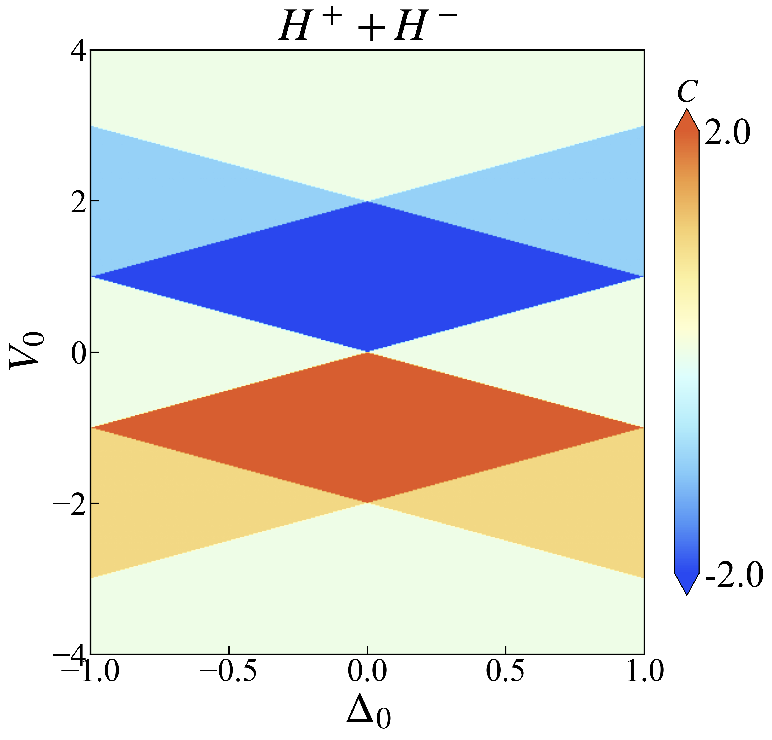
继续优化一下,因为这里其实想用的颜色来区分体系的Chern数,但是colorbar却是渐变色,表意不明。实际上就需要将colorbar的色条也做离散处理
    colorbar_label = np.sort(list(set(z0)))   # Z0 是整个区域中的Chern数
    levels = np.linspace(z0min,z0max, len(colorbar_label) + 1)  # 分成 5 份,需要 6 个边界
    norm = BoundaryNorm(levels, ncolors = 256)  # 将颜色映射到指定的区间
    sc = plt.imshow(z0, interpolation='bilinear', cmap = cmap, origin = 'lower', extent = [x0_min, x0_max, y0_min, y0_max],norm = norm)  # 设置坐标轴范围
上面的代码中$z0$是整个区域中的Chern数,通过取集合的方式去除重复的数就能得到所有的Chern数了。如果Chern数共有3个,那么就需要将颜色分成4份,也就是用第二行代码控制。最后在绘图的时候再通过norm参数来实现颜色条离散的控制,结果如下
完整的绘图代码如下
import numpy as np
import matplotlib.pyplot as plt
from matplotlib import rcParams
import os
from matplotlib.colors import LinearSegmentedColormap,BoundaryNorm
plt.rc('font', family='Times New Roman')
config = {"font.size": 35,"mathtext.fontset":'stix',"font.serif": ['SimSun']}
rcParams.update(config) # Latex 字体设置
#------------------------------------------------------------------------------------------------------------------------------------------------------------------------------
def Make_color(color):
    # with open("LightTemperatureMap.dat", "r") as file:
    with open(color, "r") as file:
        lines = file.readlines()
    # 解析颜色数据
    colors = []
    for line in lines:
        # 去掉多余的字符(例如 "RGBColor[" 和 "]")
        line = line.replace("RGBColor[", "").replace("]", "").strip()
        # 按逗号分割,提取 R, G, B 值
        r, g, b = map(float, line.split(","))
        colors.append((r, g, b))
    # 将颜色数据转换为 matplotlib 的 colormap 格式
    cmap = LinearSegmentedColormap.from_list("LightTemperatureMap", colors)
    return cmap
#------------------------------------------------------------------------------------------------------------------
def plot_Chern_Number(ind):
    if ind == 1 :
        dataname = "Phase-Chern-delta0V0.dat"
    elif ind == 2 :
        dataname = "Phase-Chern-J0V0.dat"
    else:
        dataname = "Phase-Chern-delta0J0.dat"
    picname = os.path.splitext(dataname)[0] + ".png"
    da = np.loadtxt(dataname)
    x0 = da[:, 0]  # delta0 数据
    y0 = da[:, 1]  # d0 数据
    z0 = np.array(da[:, 2])  # Chern 数数据
    colorbar_label = np.sort(list(set(z0)))

    # 获取 delta0 和 d0 的范围
    x0_min, x0_max = np.min(x0), np.max(x0)
    y0_min, y0_max = np.min(y0), np.max(y0)

    # 将 z0 数据重塑为二维数组
    xn = int(np.sqrt(len(x0)))
    z0 = z0.reshape(xn, xn)
    z0min = int(np.min(z0))
    z0max = int(np.max(z0))
    levels = np.linspace(z0min,z0max, len(colorbar_label) + 1)  # 分成 5 份,需要 6 个边界
    norm = BoundaryNorm(levels, ncolors = 256)  # 将颜色映射到指定的区间

    # 创建绘图
    plt.figure(figsize=(10, 9))
    # cmap = Make_color("LightTemperatureMap.dat")
    cmap = Make_color("RedBlueTones.dat")
    # sc = plt.imshow(z0, interpolation='bilinear', cmap="magma", origin='lower', extent=[x0_min, x0_max, y0_min, y0_max])  # 设置坐标轴范围
    # sc = plt.imshow(z0, interpolation='bilinear', cmap = "RdYlBu", origin = 'lower', extent = [x0_min, x0_max, y0_min, y0_max])  # 设置坐标轴范围
    sc = plt.imshow(z0, interpolation='bilinear', cmap = cmap, origin = 'lower', extent = [x0_min, x0_max, y0_min, y0_max],norm = norm)  # 设置坐标轴范围
    # sc = plt.imshow(z0, interpolation='bilinear', cmap = "jet", origin = 'lower', extent = [x0_min, x0_max, y0_min, y0_max],norm = norm)  # 设置坐标轴范围

    # 添加 colorbar
    # cb = plt.colorbar(sc, fraction = 0.03, ticks=[np.min(z0),-1,0,1, np.max(z0)], extend = 'both')
    cb = plt.colorbar(sc, fraction = 0.03, ticks = colorbar_label, extend = 'both')
    # cb = plt.colorbar(sc, fraction = 0.03,  extend = 'both')
    cb.ax.set_title(r"$C$", fontsize = 30)
    cb.ax.tick_params(size = 1)
    # cb.ax.set_yticklabels([format(np.min(z0), ".1f"), format(np.max(z0), ".1f")])


    if dataname == "Phase-Chern-J0V0.dat":
        plt.ylabel(r"$V_0$")
        plt.xlabel(r"$J_0$")
    elif dataname == "Phase-Chern-delta0V0.dat":
        plt.xlabel(r"$\Delta_0$")
        plt.ylabel(r"$V_0$")
    else:
        plt.xlabel(r"$\Delta_0$")
        plt.ylabel(r"$J_0$")

    plt.tick_params(axis ='x',width = 1,length = 8, direction = "in")
    plt.tick_params(axis = 'y',width = 1,length = 8, direction = "in")
    # plt.axhline(y = -0.5, color = 'red', linestyle =':', linewidth = 1.5)  # 红色实线
    # plt.axhline(y = 0.5, color = 'blue', linestyle =':', linewidth = 1.5)   # 蓝色点线
    # plt.axvline(x = -0.5, color = 'red', linestyle =':', linewidth = 1.5)  # 红色实线
    plt.axvline(x = 0.5, color = 'black', linestyle ='--', linewidth = 3.0)   # 蓝色点线

    # plt.axis('scaled')

    # 设置坐标轴样式
    ax = plt.gca()
    ax.locator_params(axis='x', nbins=3)  # x 轴最多显示 3 个刻度
    ax.locator_params(axis='y', nbins=3)  # y 轴最多显示 3 个刻度
    ax.set_aspect('auto')  # 自动调整比例
    ax.spines["bottom"].set_linewidth(3.0)
    ax.spines["left"].set_linewidth(3.0)
    ax.spines["right"].set_linewidth(3.0)
    ax.spines["top"].set_linewidth(3.0)

    # 保存图像
    # plt.show()
    plt.savefig(picname, dpi=300, bbox_inches='tight')
    plt.close()
#------------------------------------------------------------
if __name__=="__main__":
    plot_Chern_Number(1)
    # plot_Chern_Number(2)
    # plot_Chern_Number(3)
其中的第一个函数Make_color中的输入就是用Mathematica导出的颜色文件的名称了。
文件下载
所有使用到的数据和绘图程序点击这里下载
公众号
相关内容均会在公众号进行同步,若对该Blog感兴趣,欢迎关注微信公众号。

|
yxli406@gmail.com |